Introduction
The single most important learning point in accomplishing this assignment has been to appreciate the implied contract between photographer and subject. Balancing the vision of what I want a portrait to look like, with my subjects vision of herself, limits the breadth of what I can achieve, but at the same time adds depth. My subject is Heidi, my partner and wife for the past 16 years and someone for whom I have a very unique and special relationship. Early on in the sessions for this assignment I realized that I could only portray her as the woman I love, not as an impersonal object to be manipulated within the frame of my camera. The style and technique of say, Richard Avedon, would have alienated her and whilst I may have created interesting images, there would have been a total lack of empathy and communication in the images. However, working with Heidi gave me more time and a very supportive subject, meaning that I had greater freedom to experiment and explore, adding depth to the portfolio.
The result is that I have created a series of images that reveal Heidi as I see her, through the perspective of love and affection. A future goal will be to find other subjects, exploring different emotions and attitudes to the relationship between subject and photographer. I am not looking for confrontation, but equally do not wish to automatically attempt to flatter the subject. I plan to look at the work of other portraitists I find interesting, such as Richard Avedon, Annie Liebovitz, Diane Arbus, or Walker Evans as examples, try to understand what makes their style and see if I can produce something similar. Looking at other peoples work is one thing; trying to reproduce it would be an interesting challenge (to whatever extent I can).
I could have chosen another subject; however, even my closest friends might have pushed back to spending a 3 day weekend looking down the barrel of my lens…
Another key element of this assignment is that all the images are colour; I work in colour and always have done, I am yet to really understand Black & White, however, the more I read and look at other photographers work, the more I incline towards at least experimenting in monochrome. This is an area I clearly need to build in my skill set. Again looking and thinking about how to reproduce the style of others would be a good starting point.
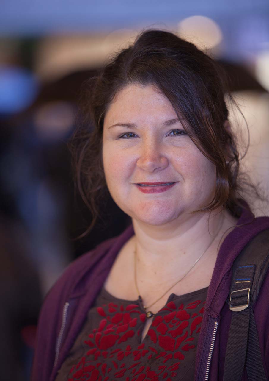
The final overall change I will make in the future is around framing, in all of the photographs I have used portrait framing and Heidi is clearly the subject. I would like to experiment with alternate framing, placing the subject to the side, possibly looking out of the frame. I want to add a greater dynamic and some tension within the frame.
Having determined that Heidi would be the subject I then needed to consider how to create 7 images with differing style and type. Aside from the variables of posing and framing, the key concern would be light and in particular different lighting conditions. Within the sequence I have taken advantage of 4 different lighting conditions, both artificial and natural:
1. Studio lighting
2. Natural Lighting
3. Artificial ambient lighting
4. Natural Lighting plus on camera flash
Within each of these I have varied the positioning and intensity of the light. I have also varied location and background. Altogether these photographs came from 8 separate sessions and around 500 separate shutter presses, the advantage and curse of digital photography. All of the photographs are created using my Canon EOS 5D Mark II; details of the lenses and exposure will be appended to the notes accompanying each photograph. RAW conversion and all tone/colour adjustments were made in Lightroom 3 prior to outputting to JPG and Print.
Photograph 1 – Studio Portrait
135mm, f/8, 1/125s, ISO 100
My first portrait is the one that took the most time. The posing is very much standard portrait, the head is tilted slightly in both vertical and horizontal axes and although Heidi is smiling it is a relaxed smile. The pearls add contrast with the black background. A hair light also provides some highlight to the image. This is one of a large number of shots made in an improvised studio in my living room at home.
I have a growing great interest in light and how it behaves in photography and have a variety of different lights accumulated over time. Recently I have acquired 2 entry level studio flash guns and then added a further 2. This was my first opportunity to use all 4. Initially I wanted a colourful background and used a bookcase, however, this was simply distracted from Heidi, so I opted to hang a black cloth as background. Using black had several advantages, creating good contrast, negative space around Heidi, and did not need to be lit separately; in fact the challenge was to avoid any light reflecting from the cloth. I set up the lights with a main light at a 45 degree angle to left of the subject looking down, with a fill directly behind and above my shooting position. The third light was then placed high up behind Heidi’s left as a hair light. The final light was behind to the right acting as a kicker to place some light on the right side of Heidi’s face.
Lighting ratio’s were roughly 4:2:1:1, with the two rear lights on minimum intensity. As my living room is not huge, this metered as f/8 at ISO100, limiting my ability to reduce the depth of field (I will explore ways of managing this in the second photograph). Lens choice is my 135mm f/2 prime obtained some time ago for precisely this type of portrait photograph. In the studio space available 135mm is perfect for head and shoulders, 85mm for upper body shots, and 50mm for full body. Whilst I do have some capable zooms, studio shots allow me to take advantage of the quality afforded by prime lenses.
Improvements I could make to this image would be to increase the power of the main light to add some more contrast, the image is too flat. The hair light is also not ideally positioned, a shallower glancing angle would be better, although I am not unhappy with this look. I would also like to work with a white background, however, at present my experiments with a white sheet show up the wrinkles in the background too much – I would need a paper roll.
Photograph 2 – Profile
135mm, f/2.8, 1/125s, ISO 100
Moving from a head and shoulders portrait I now move in on Heidi’s face. I wanted an image in which her face more or less filled the frame. A frontal image would simply be a tighter crop of the first photograph, hence my decision to present this as a profile. By moving to a profile and closing in, the structure and contours of Heidi’s face become more prominent, but so does skin texture and any small blemish. Subsequently I have opened up the aperture to f/2.8 to soften the image. I took care to try to keep the focal point on the eye, although with the very shallow depth of field, only part of her eye is in focus, something that I need to take care of next time.
This image is made in a very similar manner to the first image, although only using two lights, main and fill with a 2:1 ratio. The technical challenge of this image was that the lighting metered at f/8, which would have provided too much depth of field for the look that I wanted. I have thus added a 2 stop ND filter to the lens. This gives greater creative control, but at the expense of a distinct colour cast. This was the first time I used an ND filter in a studio setting and so at the time of shooting was not aware of this problem. As a result I made the elementary mistake of not shooting a grey card or colour profile target in this session. In post processing in Lightroom 3, I struggled to achieve natural skin tones as there was a distinctive red-brown cast to the image. In the end I have worked with White Balance set to Flash and then reduced the saturation of the red in the image. I am just getting to grips with colour management and the workflow necessary to ensure consistent colour.
Photograph 3 – Victorian Values
135mm, f/2, 1/750s, ISO 400
In reading around the subject of portrait photography I noticed a number of artistic photographs from the mid to late 19th century in which the eyes of female subjects never meet the axis of the camera lens. An example is the 1867 “The Kiss of Peace” by Julia Margaret Cameron. Unlike the portraits of the time which typically pinned the subject in a rigid posture gazing resolutely at the camera, these photographs seemed to follow a painting style of the time that held that Victorian modesty required that a women look demurely away.
This image is an attempt to capture that feeling of modesty. Heidi’s face is almost in profile, however, this is very different from the previous photograph. In that image there is a distinctly bold stare, looking straight out of the frame. In this photograph, Heidi is occupying the right side of the frame looking into the photograph. I have added a pastoral element by using the lavender as a background, but firmly out of focus, simply acting as a swatch of colour.
This photograph was actually made on the roof top of a local supermarket which had been turned into a city centre garden. The day was overcast with changing conditions; this photograph has no added lighting. I have used a higher ISO than usual to ensure a high shutter speed and selected a wide open aperture of f/2 to throw the background firmly out of focus. Creeping into the frame at the top are a number of horizontal lines created by a building in the near distance, reminding the viewer that we are still in a manmade environment. I am not sure about this, if I was reworking the shot I might try and get higher so that the background is only the flowers; can’t make my mind up on that one.
Photograph 4 – Urban
135mm, f/2, 1/1000s, ISO 400
Following on from the previous image, Heidi and I moved to a nearby location, this time looking for a distinctly urban environment and a very different style of image. Once again the light was strong and even, requiring no fill. I have again shot with the lens wide open to ensure complete separation of subject from background and foreground.
I had scouted the location a few weeks earlier during one of the exercises leading to this assignment. The rail would act as a prop for posing, but also provide a lead in line to the image. The background building is far enough away to be very much out of focus, but close enough to still provide the urban setting I wanted. Heidi dressed in grey and blue which matched the steel foreground and blue tone of the background. I asked her to lean on the rail, relax and look directly into the camera. I then shot around 10 frames moving around her to better frame the image. The sunglasses falling between the railings add a splash of colour balanced with Heidi’s hair and the triangle of red, which is the supermarket on the level below.
If I had to select a single image from this submission, this is the one.
Photograph 5 – Backlit
24-70mm at 70mm, f/2.8, 1/60s, ISO 1600
In exercise 4, “An active portrait” I photographed Heidi cooking a meal as an example of activity. The challenge was to work in a very small space with very mixed and challenging lighting. The most effective images in the sequence were those with Heidi’s head backlit by the window shot from inside the kitchen. Addition of artificial light took away the atmospheric lighting provided by the open window.
For the assignment I have returned to this location, however, this time I have engaged directly with Heidi and asked her to look at the camera. This was not a carefully planned shot, unlike most others in this submission, but a “suck it and see” experiment, that worked out. The shot is very simple, head and shoulders, with the body at 45 degrees and the face turned towards the camera. The only light is the window directly behind Heidi and the light reflecting back from kitchen walls and cabinets. Fortunately our kitchen is white and grey so the reflection did not create a colour cast in the image. Although quickly done this was not an easy shot to take. I used a medium range zoom as I was not sure on the framing for the shot and wanted flexibility. As the lens was relatively slow at f/2.8 (compared to a prime) and lacked any image stabilization I had to increase the ISO to 1600 and even then 1/60s was marginal at 70mm. I spot metered off Heidi’s face and happily accepted completely blown out highlights. I shot around 20 frames and selected the best, many were out of focus!
This has resulted in a very soft dreamy look to the photograph, and due to the very informal way it was set up a very natural look. This is Heidi!
Photograph 6 – Shopping
70-200mm at 160mm, f/2.8, 1/90s, ISO 400
The assignment asked for 5-7 photographs and if submitting 5 I would stop now, however, this is a learning experience and whilst my final 2 images are not as strong as the others I feel it is worthwhile including them and explaining why. They both add to the story that is Heidi, but do not have some of the qualities of the previous 5. In fact I have better images in the reject pile, but all of these are from the same sessions as those previously and add nothing.
The background to this photograph was that I wanted to add an image of Heidi in the city in heavy traffic, almost looking for a street photography look. Unfortunately, the weather and time conspired against me and heavy rain meant that my preferred outdoor location was unusable forcing us into a covered shopping area. I asked Heidi to walk ahead of me and occasionally stop, look at the camera and then move on again. This is the photograph that worked best, she is stopped opposite a shop window, and whilst there is not the confusion of people in the background that I was trying to achieve, it is still clearly a busy colourful world.
The technical problem was the light, a mixture of overhead strip lighting, natural light and fill flash from an on camera strobe. Sadly there was nothing neutrally toned in the image and so getting the tones right was very hit or miss. This type of light was also not very flattering and again I had to draw down the saturation in the red channel. Use of a grey card would have helped, but taken away the spontaneity I was trying to achieve.
What I was looking for (and will return to) was a photograph of Heidi with shallow enough depth of field that she would stand out, but with the frame full of other people but all out of focus.
Photograph 7 – Comfortable
70-200mm at 125mm, f/2.8, 1/90s, ISO 100
My final image is the only full body portrait in the submission. Heidi is sitting on a bench just outside the front door of our row house, enjoying the evening sun and trying to escape from her irritating husband. I have framed the shot to try and place Heidi into the environment. All of my other images try to isolate the subject from foreground and background. Here I have deliberately allowed the foreground to partly overlap Heidi’s legs and chosen a location in which the background is virtually in the same plane as Heidi. This image has more of the nature of a snapshot than a carefully crafted artistic portrait, but is the photograph in the sequence that our friends point to as their favourite.
Although a partial aside, the idea of bringing the background into the same plane as the subject is one that I find very effective and whilst careful choice of background is very important, can be very dramatic. I refer to Walker Evans photograph “Allie Mae Burroughs, Wife of a Cotton Sharecropper”. The key element to the photograph is clearly the hard stare of the subject and the implied hardship, however, the photograph is made more forceful by the abruptness of the wooden background. Food for thought!