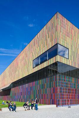
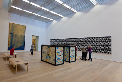
This museum is possibly my favorite building in Munich. It contains a varied and eclectic collection of modern art, however, the building is without doubt a work of modern art in its own right. It was opened in May 2009 and contains more than 700 works of modern art. The most impressive collections are from Andy Warhol and Cy Twombly. The whole upper floor is dedicated to Towmbly's work, some of it I really enjoy, some I find perplexing. The Andy Warhol Collection is very much more to my taste and is complemented some really thought provoking works by Damien Hirst.
However, the goal of this visit was to study the museum as a building in use. First of all I could not resist taking some "architectural" shots of the museums remarkable exterior. It is covered with 36,000 vertical ceramic louvres in 23 different colored glazes. Shot in good light and taking advantage of the blocky perspective it offers I produced the following two images - both using a 24mm tilt-shift lens with my camera mounted on a tripod
In both of these photo's I have boosted the colour and contrast, however, on a clear bright day this building almost glows. The use case here is two fold, the first is very simply "to be seen as art", however, this is backed up by creating a really attractive and interesting place to sit and enjoy the sun.
My guide to Munich architecture, blogged in an earlier post, uses this building as its front cover. I wanted to reproduce something similar and shot the following abstract composition
Inside the building is still very impressive with massive wooden staircases providing access to the three levels of the museum:
The top floor is dominated by a number of huge brighly lit rooms displaying huge canvasses of work by Cy Twomberly. These are wonderful spaces allowing the visitor to step back and contemplate the works as a whole or get really close to inspect the technique and materials used.
\
The middle floor contains smaller rooms, however, the basement is one cavernous room with a few small offshoots:
The two boxes contain medical waste and are part of a series of works by Damien Hirst that comment on modern dependency on medicine. Behind that is Andy Warhol's last supper. On the opposite wall is the following work and the one I am most drawn to when visiting the museum. The display is a massive mirror on which are mounted tiny mirrored shelves supporting rows of multi-colored pills, another Damien Hirst work on our addiction to Pharmaceuticals. I have cropped the shot to only include the mirrored art work which then creates a strange perspective containing a reflection of the room behind and the work itself. I am also included, no easy way out of that:
This neatly illustrates people enjoying a work of art, but almost from the perspective of the piece itself. This is a complementary image to the one that I produced of two children silhouetted against the Luigi Colani exhibit in the Pinakothek der Moderne.
From the ground floor it is possible to tilt your head (or camera) back and see all the way up to the top floor
I am not sure about this image, I tried to create an interesting perspective, choosing not to square up the frame, but maybe too distorted, don't know.
Finally the museum offers a few small rooms from which it is possible to look out onto the other Museums nearby (the near building is the Pinakothek der Moderne, the far one the Alte Pianakothek). This is the window seen in the first image in this blog entry. Chairs are provided accompanied by books containing a description of the museum and its art work. This is a very relaxing place to contemplate what you have just seen and provides an unusual perspective on other buildings
Both this and the Modern art museum images are for me the best I have taken so far in this planning sequence, however, I am not sure if I want to include two museums. On the other hand art museums make for very interesting interactions between people and architecture.


No comments:
Post a Comment