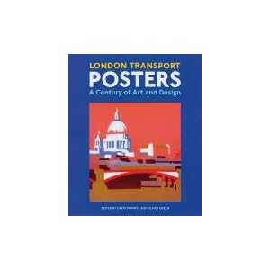
The posters will be designed around the European ISO paper sizes, in my case A4, but each would be scalable to whatever size is needed. The graphical elements will be simple, block lettering in simple rectangles of text, a simple but modern looking style. For inspiration I have been looking at the designs for London Undergrounds famous poster series, even bought a book to help:
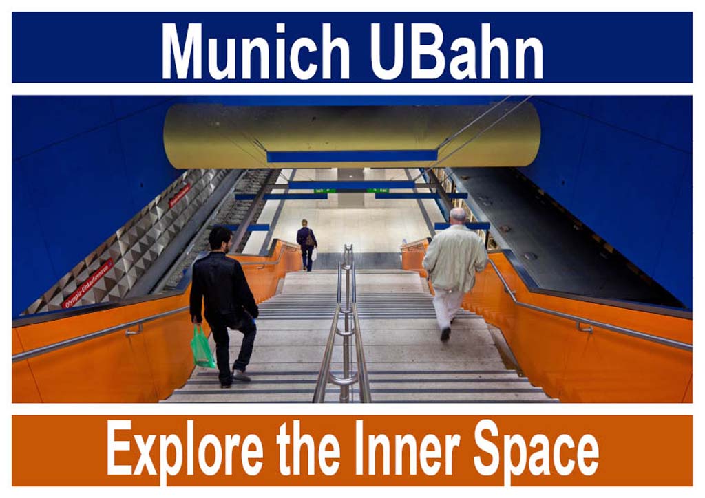
After some thought I have decided on 3 essential designs for the campaign, each headed by the Words "Munich UBahn" and then combining a slogan that maps to the photograph. The importance of completing this step is that the design dictates the framing of the photographs. For two of the designs I have chosen square framing, partly because I want to experiment with this prior to a possible jump into medium format film photography where I would probably go with a 6x6 or maybe 6x7 format. For the third design I have chosen an almost Panoramic framing of 28.7x13, the numbers dictated by the size of an A4 sheet of paper.
My first concept is a development of the image I used in my previous post

Another idea for this assignment is to use the exits of the system and juxtapose the UBahn sign against the background architecture of Munich, this is a poor but illustrative example

In each case I am using an eye dropper tool to grab colour from the frame for the signage around the photo. Also using a square image, I have created a simple horizontal design

Not too sure about the text, but this is the drift I have at present. Using the panoramic framing provides the following two mock-ups. I cannot say that I like the photograph in the first image, however, the vanishing point is striking, just not so great for an advertising campaign

The second of these two images, uses the colour of the text backgrounds to further emphasize the colour of the included frame, might end up using this one.
I have yet to finalize the brief, but the current plan looks something like the following
"Produce photographs that can be used in an advertising campaign to encourage foreign visitors to use Munich's underground transport system. We would envisage that the posters would be displayed in arrivals at the airport or in guides to the city. Aim to develop 8-12 different concepts in a mix of portrait and landscape formats. Develop images that include 1 or more of the following properties of the system:
- Colour and Architecture of the Stations
- How the system integrates with the City
- Use of the system by the people of Munich
- The facilities available to the traveler
Develop sample slogans and poster concepts to support your imagery"
This is a perhaps too vague, although I think I need to allow myself sufficient latitude to develop the concept, too many constraints could limit the scope of the imagery I plan to develop. Keep it simple!

No comments:
Post a Comment